Project Type
Website Design, Interaction Design
Problem
Timeline
October 2022 - January 2023 (12 Weeks)
Role
Lead Designer
Context
Gotcare is a healthcare services provider based in Toronto, ON expanding beyond its core service offering of Individual Private Home care to include Community Health Monitoring and Data Analytics tools, with a goal of reaching new occupational therapy (OT) and hospital customer segments.
Gotcare’s website users faced difficulties in finding new information due to non-responsive design and cluttered page layouts throughout the information architecture.
On the business side, the website’s information architecture failed to organize and represent Gotcare's services, industry education, and community impact effectively.
Solution
Less is more.
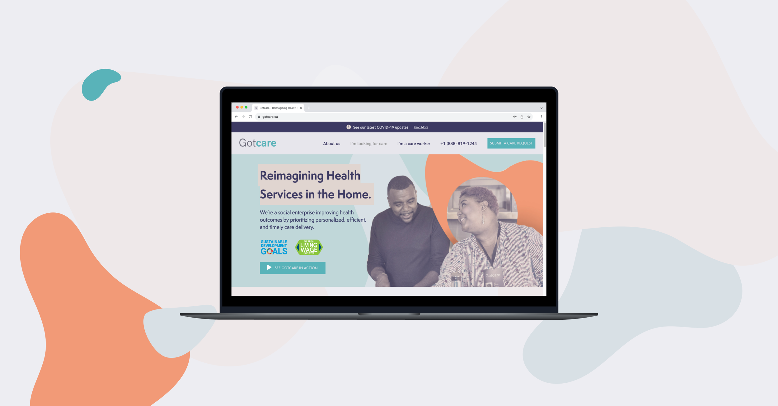
Dynamic Header
provides more context and enhances engagement at first glance, featuring Gotcare’s employment certifications, a description, and an embedded video.
About Us
creates additional space for Gotcare to showcase their company ethos, their story, their people, and their impact.
The new approach to the website focused on simplifying the information on the home page and reorganizing important information into other areas within the information architecture.
Concise article list design
highlights Gotcare’s new and existing service offerings, as well as their credibility and impact. The list layout directs the reader’s attention to the contact CTA associated with their corresponding need.
Process
Initial Explorations
Performed a design critique of the current website and explored usability feedback from the End-Of-Year client, care worker, and insurance case manager survey. The exploration showed:
The home hero gap was not wide enough to indicate the need to scroll down, and lacked a CTA and information about the company
The home page had a cluttered information hierarchy with competing pieces of information and CTA’s, making user navigation path confusing and unclear
Many steps were required to get to the main care request sign-up form; ineffective prioritization of information; industry information, and testimonials took up too much space and were not concise
Sections of the home page were often cut off — non-responsive design and missing CTA’s made it unclear what the next step was for users
Design Goals
Simplify homepage flow to include key elements of business, area of credibility, and clear CTA’s accessible in each section
Redirect the remaining information (industry information, impact) to the new About Us page
Redirect large care request (Looking for care) form to jump on the page, preventing confusion of original service offering with new service offerings being displayed
Sketching and Exploration
Researched competitor platforms for common UI patterns for inspiration
Experimented with carousels, cards, continuous scroll, categorization via multiple iterations and feedback sessions with advisors and developers
Metrics of Success
User problems solved
easier access to each service offering’s CTA
clear indication to scroll and access to information
more information provided at first glance in hero
Business problems solved
highlight new service offerings while including a clear CTA to existing private home care request form
clear organization of impact, team, and industry findings in new About Us page


